ありがたいことに最近は、VTuberさんを含め依頼者さんのオリジナルキャラクターを描いて欲しいという依頼が増えてきました。このような時に、私が制作を進めるにあたり気を付けていることは、私が描くキャラクターの見た目が依頼者さんのキャラクターに「似ている」ことです。依頼者さんはお金を出してまで、私を信じて自身のキャラクターを送り出して依頼してくれているわけですから、似ても似つかないものを描いてしまってはガッカリされてしまいます。
Thankfully, I have recently received an increasing number of requests to draw original characters for clients, including VTubers. In these cases, I am careful to make sure that the characters I draw "look like" the client's character. The client has paid money to send me their character because they trust me, and they are disappointed if I draw something that looks nothing like them.
今回は、以前に私がご依頼を受けた方の承諾を得て、制作のために頂いた資料と実際に私が描いた絵を並べて、キャラクターを似せるために何を考えて制作を進めたか、私自身の忘備録も兼ねて書いてみたいと思います。
In this article, with the permission of my previous clients, I would like to write about what I considered in order to make the characters look like each other, juxtaposing the materials I received for the production with the actual drawings I made. This also serves as my memorandum.
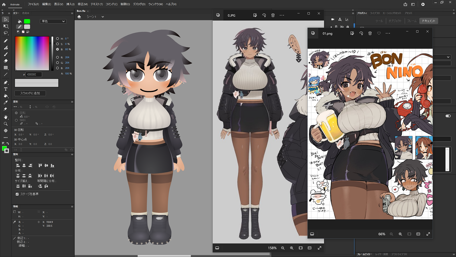
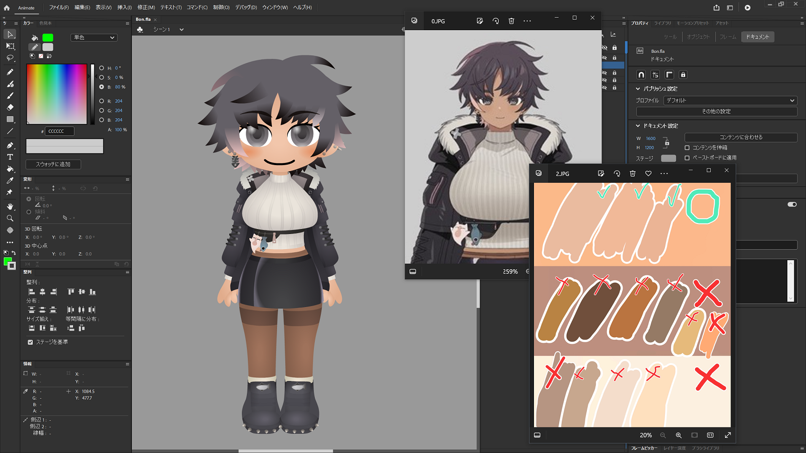
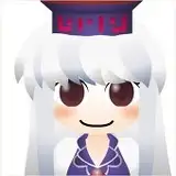
Vtuberであり、自身もアーティストであるBONさんからの依頼で制作したアニメーションです。まずは、私が描いた絵と制作のために頂いた立ち絵の資料を並べてみます。
This animation was commissioned by BON, a Vtuber and artist in her own right. First, let me lay out my drawings and the standing materials I received for the production.
頭身が違うのを始めとして両者の全身像は大きく異なりますが、それでも同一のキャラクターとして認識していただけるのではないでしょうか。
Although their full-body images are very different, including the different size of their heads, I believe that you will still recognize them as the same character.
次に、顔を見てみます。
Next, let's look at the face.
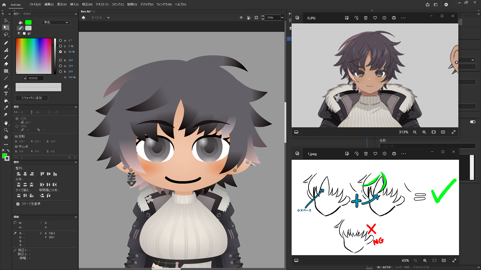
今回は、前髪の形について資料をいただいていました。前髪は、目と同様にキャラクターの印象を決める重要な部分でもあるので、こうして資料を頂けるのはありがたいですね。
髪については、毛束ごとに形や数がなるべく同じくなるように描いています。また、髪も含めて頭全体のシルエットが卵を逆さにしたような形の印象なので、毛束の位置や大きさを調整して、同じような印象になるようにしています。頭が大きく横に長い私の絵柄の関係上、まったく同じ形にはなりませんが、なるべく近くなるように。髪にはピンク色のハイライトが入っているので、それも入れています。耳にはアクセサリーがありますね。
This time, I was given material on the shape of the bangs. The bangs, like the eyes, are an important part of the character's impression, so I am grateful to have these materials.
I drew the hair so that the shape and number of hair bundles would be the same for each bundle. The silhouette of the head as a whole, including the hair, gives the impression of an upside-down egg, so I adjusted the position and size of the hair bundles to give the same impression. Due to my painting style, which has a large head and long sides, it is not possible to achieve exactly the same shape, but I tried to make it as close as possible. She has pink highlights in her hair, so I have included those as well. You can see the accessories on her ears.
肌の色についても資料を頂いていました。私の場合、グラデーションを使って色を塗るので、該当の色(今回は上段の真ん中)から少しだけ明るい色と少しだけ暗い色の二色を使ってグラデーションを作り、全体の印象が該当の色に近くなるように調整しています。
I also received material on skin color. In my case, I use a gradient to apply the color, so I created a gradient using two colors, one slightly lighter and one slightly darker than the relevant color (in this case, the middle of the upper row), and adjusted the overall impression so that it is closer to the relevant color.
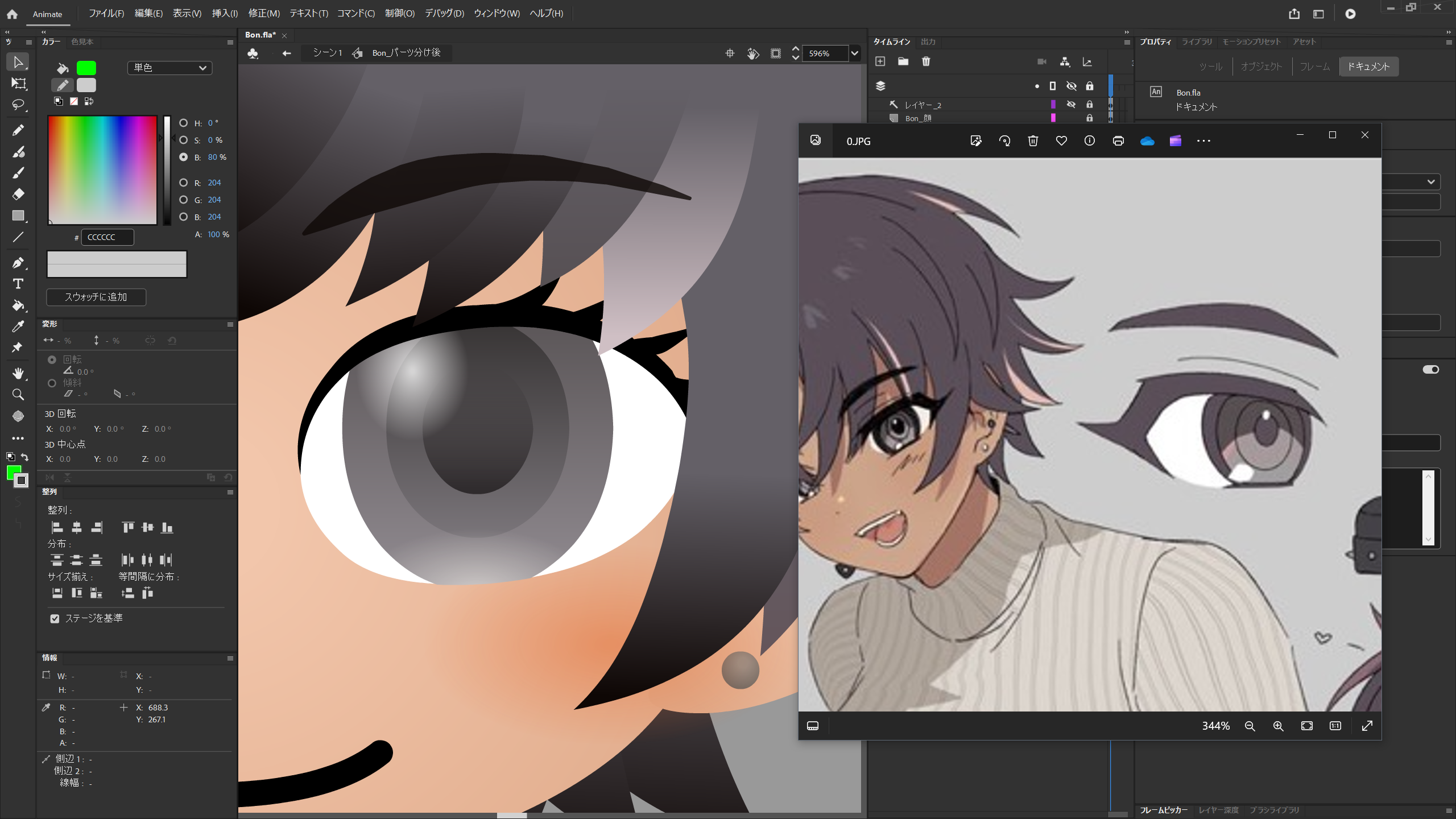
元の絵では、虹彩が二段階に分かれて描かれています。私は普段は虹彩をこのように表現はしていないのですが、元のデザインに合わせています。虹彩の外周に黒い部分がありますが、私はこれを輪郭として解釈し、輪郭線を使わない私の絵柄に合わせて今回は外しています。ここに黒を入れると表現が強くなりすぎてしまうからでもあるのですが、試行錯誤の余地はあったかもしれません。
今見ると、ハイライトの位置や数が違いますね。睫毛の形も、もう少し合わせられたかもしれません。もしまたご依頼を頂ける機会があれば、直しておきたい部分です。
In the original drawing, the iris is drawn in two stages. I do not usually represent the iris this way, but I have adapted it to the original design. There is a black area around the perimeter of the iris, but I see it as an outline, and in keeping with my painting style, which does not use outlines, I have left it out this time. This is partly because adding black here would have made the expression too strong, but there could have been room for trial and error.
Looking at it now, the position and number of highlights are different. The shape of the eyelashes could also have been a little more in line with the original drawing. If I have the opportunity to be asked to do this again, I would like to fix this part.
次は胴体です。
Next, let's look at the torso.
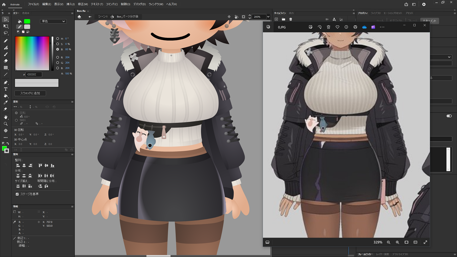
胸や腰の位置や大きさのバランスを見ながら、自分の絵柄に合わせつつ落とし込んでいきます。頭と同様、やや横に長い私の絵柄に合わせるため、胸や腰はやや横方向に広がった印象でしょうか。スカートの長さや素材感、上着の裾や袖はどこまで伸びているかなど服の形にも注目しながら描いています。
While observing the balance of the position and size of the chest and hips, I dropped them in while adapting them to my painting style. As with the head, in order to match my painting style, which is somewhat long horizontally, the chest and hips give the impression of being slightly spread out horizontally. I also pay attention to the shape of the clothes, such as the length and material of the skirt, and how far the hem and sleeves of the jacket extend.
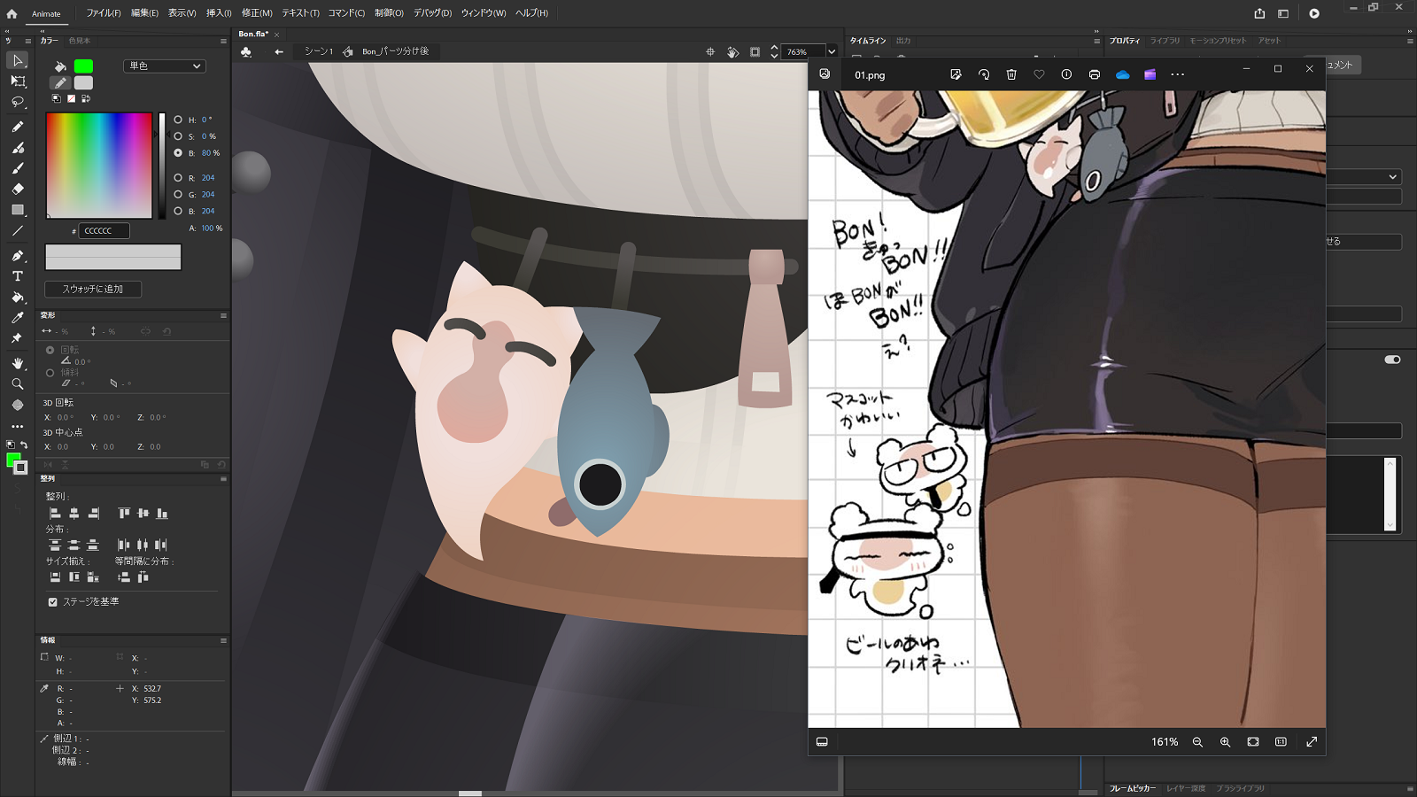
腰に付けているアクセサリー。はじめは魚の隣にあるものが何なのか分からなかったのですが、どうやらクリオネのようでした。資料をよく確認することは大事ですね。
An accessory worn around the waist. At first I could not figure out what it was next to the fish, but it appeared to be a clione. It is important to check the material carefully.
最後に足です。
Finally, let's look at the feet.
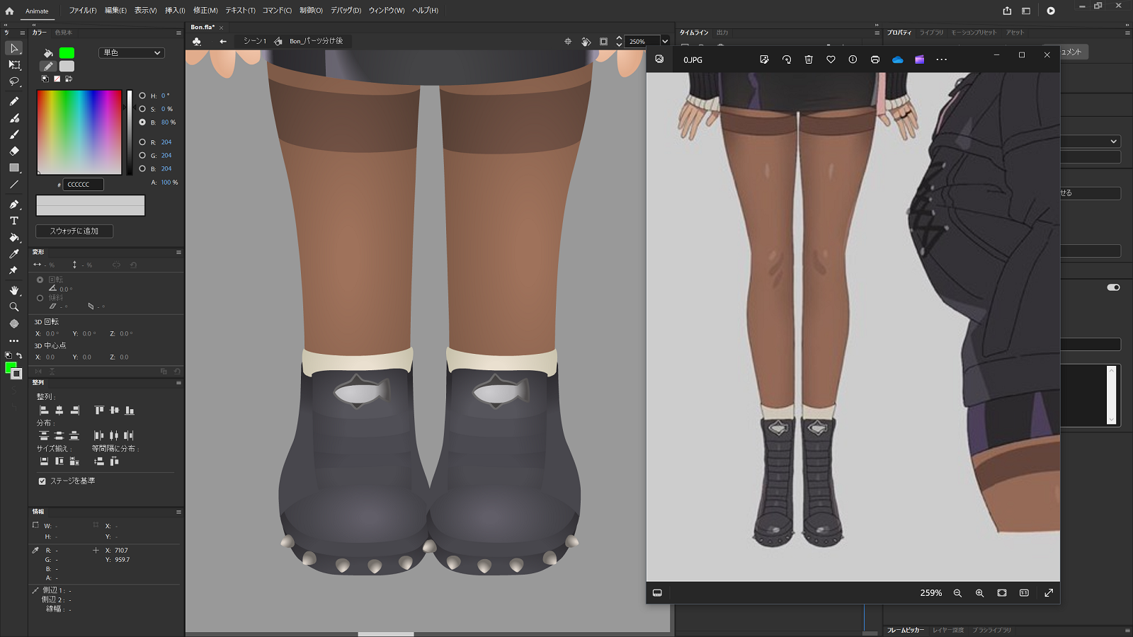
元の絵と比べると膝から下がやや太めですが、この辺りは私の作風あるいは好みということで今回はご勘弁いただければと…。
ブーツのソール部分にはトゲ状の装飾が付いています。タン(甲部のパーツ)には魚の模様の装飾が、キャラクターから見て右向きに付いています。何も考えずに足のパーツを左右反転すると、魚の向きも逆になってしまうので注意が必要ですね(動画の制作中にやらかしかけました)。
Compared to the original, the area from the knees down is a little thicker, but I hope you will forgive me if I say that this is my style or preference....
The sole of the boots is decorated with spikes. The tongue (instep part) has a fish pattern decoration facing to the right as seen from the character. If you flip the foot parts left and right without thinking, the direction of the fish will be reversed as well, so you need to be careful (I almost did this while making the video).
ここまで長々と書いてきましたが、結論としては「資料をよく見て描く」の一言に尽きます(自戒の意味も込めて)。今回は、元のデザインにあるものはなるべく省略しない方向で描いていきました。もしデフォルメ表現を強くすれば、デザインの省略が発生することがあり得ますし、依頼の内容によってはアレンジが求められることもあるでしょう。その場合でも、元のデザインを一度全て拾っておくことで、取捨選択やアレンジをする際の判断の助けになるかもしれません。今回の場合で言えば、「海の生き物をモチーフにした装飾が所々に見られるから、その要素は外さない方が良いかな?」といった感じでしょうか。
I have written at length so far, but I can only conclude with one word: "Look carefully at the material and draw it" (with a sense of self-discipline). This time, I tried not to omit anything in the original design. If the deformation expression is strengthened, it is possible that the design will be omitted, and depending on the request, it may be necessary to rearrange the design. Even in such cases, picking up all the original designs once may help in making a decision to discard or rearrange them. In this case, it might be something like, "Since decorations with sea creature motifs can be seen in some places, I should probably incorporate those elements".
冒頭にも書きましたが、依頼者さんは私を信じて自身のキャラクターを送り出してくれているわけですから、元のデザインを活かした上で、私らしい絵を描いていけたら良いですね。
As I mentioned at the beginning of this article, the client has sent me their own character because they believe in me, so I hope I can draw a picture that is uniquely mine, making the most of the original design.